
12.03.2008

MOLLYDOOKER WINES


earlier in this semester i had to do a project for my package design class where we had to design labels for wine bottles. of course every design project begins with research, so i set about looking at different wineries and their label design. i saw many great labels, but one winery stood out to me. and that is Mollydooker from McLaren Vale, Australia. 

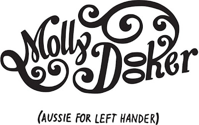
Mollydooker was started by Sarah and Sparky Marquis, a married couple with a history in winemaking. They started their winery in 1998, and have been creating fantastic wines (with fantastic labels) ever since. The name Mollydooker is actually Aussie-slang for "left handed."

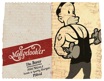
first of all, i love their logo. the two-line version is a knockout, but it also translates well to a single-line logo (find the two different ones above). i really am attracted to their overall label design though; they have a sort of vintage feel with the torn edges, faded colors, and illustration styles. 

a unique thing about their packaging, too, is that they started the trend of adding little collectible peel-off tabs so that customers can find the same bottle again at the store. it also doubles as a reminder of what you drank when you cant really remember the next day... also a lot of their labels wrap around so that you are more likely to buy the wine because you have to pick up the bottle (proven research, folks). AND some of their labels fit together to make a complete image, and all of them are personal to the couple and their family.

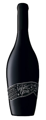
i think my favorite label is the Velvet Glove, which is a label actually made of velvet, with silver foil pressed into it. it even comes in a black velvet bag with satin rope ties on it. explains the $75 pricetag!

im not exactly sure who designs their labels; i couldnt really find an answer for that. but take a look around the website (which is also beautifully designed) and look at more of their labels.


i wish WALL-E was real.


for my birthday this year i received a copy of the disney/pixar movie WALL-E, which i saw in theaters while it was out. i have a mild obsession with robots, so i knew i would love the movie. AND I DID. 

first of all, wall-e's voice, the way he talks, the words he speaks, and his overall mannerisms are so hard to resist. seriously, try watching the movie with subtitles. add in the "saving the earth" theme and not to mention a robot love story. this is probably my favorite disney movie ever. 

now i just have a small 19-inch pink hello kitty tv that i got for my 16th birthday. therefore, HD did not exist then and im not upgrading any time soon. even though i watched it over 5 times during thanksgiving weekend, there were many details that i never even noticed. i didnt notice them until i was at my local meijer store, and while browsing the ipod accessories i heard that old familiar chirping of a  robot (my favorite is when wall-e hums the tune of his favorite song), so i immediately went to the giant wall of HD tv sets (various sizes). 

now i know i was standing pretty close to it, but let me just say that i am AMAZED by the level of rendering that is possible today. i know pixar is pretty much the best when it comes to 3D animation, but i didnt know it was like this. can we say ART FORM?? certain scenes in the movie (in fact pretty much all of it except for the people that live aboard the Axiom) look like they are live action scenes instead of 3D computer graphics. 

ive always wanted to be able to draw well; i dont think that is happening any time soon. and if i think that regular 2D drawing is difficult, i can only imagine the amount of work it takes to  produce an entire full-length film in 3D graphics.

either way, i recommend seeing wall-e. if you cant appreciate a rolling droid (who has a pet cockroach) courting a hovering bot, then at least you can appreciate the amazing, very convincing graphics. 

NOTE: the photos dont do the little guy justice. see the movie. on a larger screen, preferably in HD or on Blu-Ray.

PUBLIC PARKING: now a designed space?


i think most people have a similar idea about parking garages: bane of driving existence. 

sometimes we find ourselves zigging and zagging around these tall concrete megaliths, turning around enough times to make one dizzy. they are cramped, confusing, and competitive. and most of all, the signage can be quite confusing at times.

not so for Eureka Tower Carpark in Melbourne, Australia. the signs there have been designed with the driver in mind. and by driver, i mean the frustrated and confused person behind the wheel of a vehicle they just paid an arm and a leg to park. 

german graphic designer Axel Peemoeller developed some pretty sweet signage for this parking garage: its color-coded, eye-catching, and HUGE. pretty much idiot-proof. the only catch? you have to be at just the right place to read them. otherwise it just looks like a paint-roller went haywire in the place. 

its interesting that Peemoeller kept in mind that in a space such as a parking garage, everyone traveling through it will ultimately have the same exact perspectives at some point. he kept this in mind when creating his signage.