12.10.2008

HARLEY-DAVIDSON DARK CUSTOM


harley-davidson's latest unique line of motorcycles is called Dark Custom. it has about 5 different mean-looking bikes in the line. the last photo above is the Nightster, my dream bike.

but beyond the fact that the bikes are hot, the design of the marketing is really eye-catching. VSA Partners has the Harley account, but according to partner Steve Ryan, they haven't really worked on the dark custom stuff.

the main logo for the line is a re-working of the Harley racing 1 logo. it has a skull near the top and comes in black and white. its beautiful.

the rest of the marketing has a mix between grunge and vintage styles, with scratchy handwriting fonts and gothic fonts as well. the imagery is a nice mix between hand-drawn almost comic images and of course photos of bad-asses riding their Harleys from the dark custom line. this is a huge shift from the clean cut (yes still beautiful) marketing design from VSA.

when I was at VSA recently I had the opportunity to see some preliminary design for the new H-D Ink line of clothing and bike accesories, and it is in line with the dark customs look.

this is some design I wish I was a part of.

HAND DRAWN TYPE


part of my advanced typography class is that we have to create our own typefaces. some people chose to scan in their handwriting, others (like myself) chose to start from scratch in illustrator, and still others drew typefaces to bring to computer.

I have always been fascinated with hand-drawn type and its possibilities. there is an infinite amount of ways to draw a font, and its also a good way to pass the time if you're bored.

and remember, even fonts like Helvetica and Times New Roman (and everything else) started as hand drawn type.

OPTIMA + McCAIN = LOSS??


all I have to say is that I wonder if he knew that his campaign's typeface is the same as the one on the Vietnam Veterans Memorial wall. coincidence?

either way, he lost.

(NOTE: I am not a McCaininite.)

DODGE: bringing them back.


yes, I am somewhat of a gearhead. I grew up at car shows, so I have a HUGE appreciation when it comes to classic cars. and most especially when it comes to one of the loves of my life: MOPARS.

a Mopar is essentially any Dodge, Plymouth, or Chrysler vehicle. occasionally a Jeep (earlier models) or an AMC will slip in the category though. I come from a Mopar family; my mom has a '74 Dodge Dart Sport (which I hope to own one day...) and I am yearning to get my own heap of beautiful Mopar chrome. hopefully in the form of a 1970 Challenger in panther pink. (won't hold my breath on that one.)

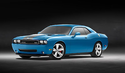
so speaking of Challengers, and since its technically product design, I want to speak on the re-release of the Challenger by Dodge. 2008 is the first year of production for the gorgeous late model design, and I have to say that for me it was love at first sight.

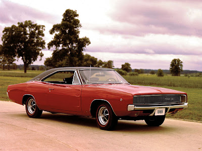
I love that the design stuck to its roots: the 1970 Challenger. the lines are nearly the same, the grille has the signature recessed headlights, and for goodness sakes, it still has the old fuel door!! the new design is a little bit wider and is more squat (you can kind of tell in the top photo), and it anything its got a little more muscle to it. except its modern muscle!!

the 2008 model came in your choice of silver, black, or hemi orange, with the option of conrasting ralleye stripes. beautiful. 2009 models will have a new blue option, a hue that is somewhat dissimilar to the classic Mopar colors. I think I will take mine in black, please.

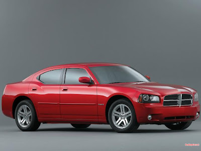
overall I think Dodge did an outstanding job with the re-release of the Challenger. unlike the situation with the Charger. when it was announced, Mopar owners everywhere rejoiced; finally there would be a suitable and mean-looking throwback. notsomuch. Dodge managed the mean-looking part, but the words "suitable" and "throwback" do not come to mind.

the new charger really does not look anything like its predecessor. maybe the body line is similar, but if you go by that, then its feasible to say that a late-model Mustang looks like the Charger. obviously not so. Dodge succeeded in slapping its iconic crossbar grille on the front of it, making it just a clone to everything else in their line. At least the Challenger front end is not like that!! and lest we forget the newer Dodge Magnum: aka Charger stationwagon.

yes, the new Charger looks tough and I even would have considered making that purchase for my first post-college vehicle, if not for the Challenger. but to call that a Charger, I disagree with. its too different. they should have just called the Charger a Magnum, and then NOT MADE THE MAGNUM ALTOGETHER.

so bottom line: Challenger = drool.

PRINT MAGAZINE >>> regional design annual 2009


i recently received my first copy of Print magazine in the mail after signing up for a student subscription through one of the my classes. this issue happens to be the 2008 Regional Design Annual.

my subscription is sadly the first design magazine that i ever subscribed to, so needless to say i am just devouring this issue. i have read every single word so far, and i dont think i am even half-way through yet. of course i have looked at all the pictures first.

for this issue, print divides up the country into regions and shows the best submitted work for each region. its delicious stuff. check out those paint cans from none other than chicago's own VSA Partners. they are beautifully retro and makes me want to repaint my room. and the rest of the house.

this was a great first issue for me to receive, and i cant wait to get the rest of them. better yet i cant wait to get through the rest of this issue!

PRINT MAGAZINE