12.10.2008

JONESIN' FOR A JONES


JONES SODA = DELICIOUS.

whats more is that Jones has gone organic and made some tea drinks. the design of the labels is amazing: its clean and fresh, the graphics are simple, and the overall design just yells out from the shelf: DRINK ME I AM GOOD FOR YOU!

the mark itself for the new line is also really great; its not stuffy like a lot of organic products. the line flows through the a, n, and i to make the word more fluid. the rounded edges are reminiscent of organic-ness in general. i also like that the branding for Jones is also included because that really adds to brand identity. im definitely looking forward to trying these products.

Jones soda itself is a unique design. the copy and logo are all neutral colors, and Jones enthusiasts can send in photos to appear on the labels. i love seeing a colorful photo because the rest of the label just makes the photo pop out. (no pun intended). and if there is  no color from the label, there is color in the drink. you can even send in your own photos and order a custom case of soda. NICE.

excuse me, but i have to go get some beverage.

DESIGN MY DRINK


DIRECTIONS:
take a walk down the organics aisle at your local jewel. stop when you get to the beverages. ADMIRE.

so much of the design in that section is white and clear (but colorful) and sans-serif and modern. and beautiful. i only put a little sampling  on this blog, so you will need to go and see for yourself. i would buy them all just for the packaging, but they are pretty expensive.

then there is a line called Crayons. they look like they taste good, but i cant really get over the name. i assume its because of the colors and shape of the can, but i dont know if i would like the idea of drinking crayons....

anyway, the original of this style of design is vitamin water. even though the labels are black and white, the color comes from the drink inside. and have you read the copy on those? genius.

thirsty??

ED HARDY


have you seen Ed Hardy anywhere lately? I'd be surprised if you haven't. the legendary tattoo artist has a presence on clothes, shoes, hats, bags, and everything. not to mention a fragrance line, which I just recently bought a bottle of. what do ed hardy's tattoos smell like? fruit and flowers.

I've always been a fan of tattoo artwork, and its kind of cool to be able to wear tattoo art without the permanence. its colorful, illustrative, vintage, and glam. the only downside is the cost. most of the designs are carried by high-end designers and so you pay for their name plus the name of Ed Hardy. but if you want the designs without paying your life savings, of course there are posters and calendars and all of the paper products. those are less expensive; i have a few different posters. 

pick up some Ed Hardy stuff for yourself. just google it and you will find something.

HARLEY-DAVIDSON DARK CUSTOM


harley-davidson's latest unique line of motorcycles is called Dark Custom. it has about 5 different mean-looking bikes in the line. the last photo above is the Nightster, my dream bike.

but beyond the fact that the bikes are hot, the design of the marketing is really eye-catching. VSA Partners has the Harley account, but according to partner Steve Ryan, they haven't really worked on the dark custom stuff.

the main logo for the line is a re-working of the Harley racing 1 logo. it has a skull near the top and comes in black and white. its beautiful.

the rest of the marketing has a mix between grunge and vintage styles, with scratchy handwriting fonts and gothic fonts as well. the imagery is a nice mix between hand-drawn almost comic images and of course photos of bad-asses riding their Harleys from the dark custom line. this is a huge shift from the clean cut (yes still beautiful) marketing design from VSA.

when I was at VSA recently I had the opportunity to see some preliminary design for the new H-D Ink line of clothing and bike accesories, and it is in line with the dark customs look.

this is some design I wish I was a part of.

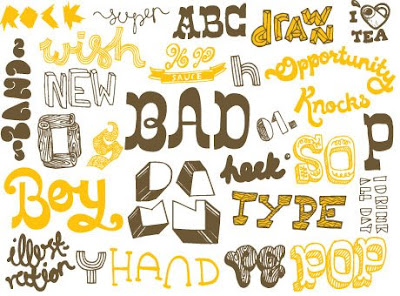
HAND DRAWN TYPE


part of my advanced typography class is that we have to create our own typefaces. some people chose to scan in their handwriting, others (like myself) chose to start from scratch in illustrator, and still others drew typefaces to bring to computer.

I have always been fascinated with hand-drawn type and its possibilities. there is an infinite amount of ways to draw a font, and its also a good way to pass the time if you're bored.

and remember, even fonts like Helvetica and Times New Roman (and everything else) started as hand drawn type.

OPTIMA + McCAIN = LOSS??


all I have to say is that I wonder if he knew that his campaign's typeface is the same as the one on the Vietnam Veterans Memorial wall. coincidence?

either way, he lost.

(NOTE: I am not a McCaininite.)

DODGE: bringing them back.


yes, I am somewhat of a gearhead. I grew up at car shows, so I have a HUGE appreciation when it comes to classic cars. and most especially when it comes to one of the loves of my life: MOPARS.

a Mopar is essentially any Dodge, Plymouth, or Chrysler vehicle. occasionally a Jeep (earlier models) or an AMC will slip in the category though. I come from a Mopar family; my mom has a '74 Dodge Dart Sport (which I hope to own one day...) and I am yearning to get my own heap of beautiful Mopar chrome. hopefully in the form of a 1970 Challenger in panther pink. (won't hold my breath on that one.)

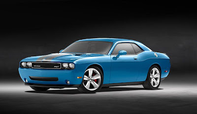
so speaking of Challengers, and since its technically product design, I want to speak on the re-release of the Challenger by Dodge. 2008 is the first year of production for the gorgeous late model design, and I have to say that for me it was love at first sight.

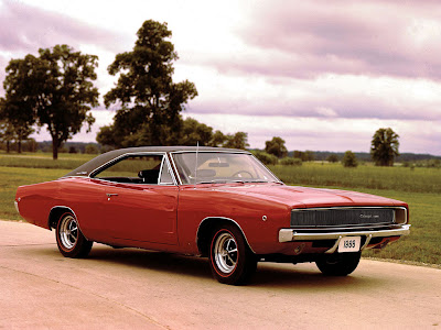
I love that the design stuck to its roots: the 1970 Challenger. the lines are nearly the same, the grille has the signature recessed headlights, and for goodness sakes, it still has the old fuel door!! the new design is a little bit wider and is more squat (you can kind of tell in the top photo), and it anything its got a little more muscle to it. except its modern muscle!!

the 2008 model came in your choice of silver, black, or hemi orange, with the option of conrasting ralleye stripes. beautiful. 2009 models will have a new blue option, a hue that is somewhat dissimilar to the classic Mopar colors. I think I will take mine in black, please.

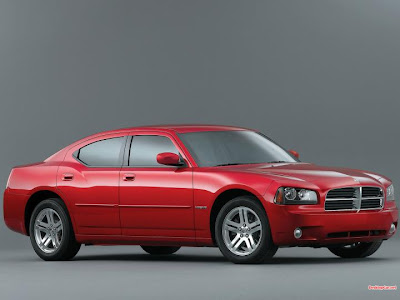
overall I think Dodge did an outstanding job with the re-release of the Challenger. unlike the situation with the Charger. when it was announced, Mopar owners everywhere rejoiced; finally there would be a suitable and mean-looking throwback. notsomuch. Dodge managed the mean-looking part, but the words "suitable" and "throwback" do not come to mind.

the new charger really does not look anything like its predecessor. maybe the body line is similar, but if you go by that, then its feasible to say that a late-model Mustang looks like the Charger. obviously not so. Dodge succeeded in slapping its iconic crossbar grille on the front of it, making it just a clone to everything else in their line. At least the Challenger front end is not like that!! and lest we forget the newer Dodge Magnum: aka Charger stationwagon.

yes, the new Charger looks tough and I even would have considered making that purchase for my first post-college vehicle, if not for the Challenger. but to call that a Charger, I disagree with. its too different. they should have just called the Charger a Magnum, and then NOT MADE THE MAGNUM ALTOGETHER.

so bottom line: Challenger = drool.

PRINT MAGAZINE >>> regional design annual 2009


i recently received my first copy of Print magazine in the mail after signing up for a student subscription through one of the my classes. this issue happens to be the 2008 Regional Design Annual.

my subscription is sadly the first design magazine that i ever subscribed to, so needless to say i am just devouring this issue. i have read every single word so far, and i dont think i am even half-way through yet. of course i have looked at all the pictures first.

for this issue, print divides up the country into regions and shows the best submitted work for each region. its delicious stuff. check out those paint cans from none other than chicago's own VSA Partners. they are beautifully retro and makes me want to repaint my room. and the rest of the house.

this was a great first issue for me to receive, and i cant wait to get the rest of them. better yet i cant wait to get through the rest of this issue!

PRINT MAGAZINE

12.09.2008

HOTELS.COM new logo


first i want to say thanks to the blog Brand New for having this image; they were the only other ones i could find...

with that, i wanted to comment on the hotels.com redesign. i think it is FABULOUS. recently i have been using that website to find an affordable hotel room down in eureka springs, arkansas. and the first recent time i went there, i saw the little surprise in the upper left corner: the condensed red type and bellboy were gone!!

hotels.com's old logo was sort of fun, but at the same time it is outdated. the new logo, designed by TBWA \ Chiat \ Day, (see the one in red above) is more sleek and sophisticated, and the graphic element is downplayed (see the "o"). also it leaves a little more to the imagination... elevator button? compass rose? something else? you decide. either way i like it. simplicity is key.

the yellow, more script-like logo is the non-US version of the logo. aka europe, asia, etc. i think that one is also successful, but it reminds me a little too much of holiday inn. especially because of that H. i think it works though; and probably just what the website/brand needed.

PEPSI re-design... better or not?


so i noticed at target that pepsi had new boxes. i didnt hear anything about them changing their logo... or logos. a bunch of products made by pepsi got facelifts as well: pepsi, diet pepsi, pepsi max, mountain dew, and sierra mist.

now i am not sure if i like this or not. it kind of reminds me of work done by a freshman design student, but hey, maybe pepsi is trying to start a trend. im not really a fan of the stark layout; i have been growing fond of all of the wackey designed backgrounds that were appearing on the pepsi cans.

the sans-serif, "modern" typeface is understandable (just talking about the pepsis themselves now), because that is sort of what is "now." but the logo redesign? in my opinion it is not different enough from the "old" logo. it just sort of looks like a registration error rather than a new logo. and if you look closely, regular pepsi, diet pepsi, and pepsi max all have a slightly different symbol (if you cant see it; look at the white space in the symbol). i dont get why they did that; didnt pepsi hear of visual guidelines for their logo?

now lets talk about mountain dew. first of all, have we become so lazy that we need abbreviations for EVERYTHING? 9 letters is apparently too long now. oops, i mean aprntly. i am liking the landscape vector background, which adds that mountain element. but the logo just doesnt do it for me. i really liked that shredder-esque mountain dew logo from before. its a good thing i cashed in my pepsi points to get a mountain dew beach towel back in the 90's; at least i will have that as a snuggly memento of what once was.

lest we forget sierra mist. i will skip over the glaring MIST for now, and talk about the creepy background. are those bare tree branches, spider veins, or green lightning? and what do any of those have to do with either "sierra" or "mist"? i suppose to tie in the name they decided to fog up the word mist to, well, make it look like mist. it hurts my eyes to look at it; and i kind of get creeped out a little too. the old logo was fun and colorful, and actually had a mountain in it at the top (translation of "sierra"). BRING IT BACK.

in fact, BRING THEM ALL BACK.

(note: i dont like pepsi and i would willingly choose a coke product over pepsi.)

12.03.2008

MOLLYDOOKER WINES


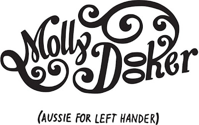
earlier in this semester i had to do a project for my package design class where we had to design labels for wine bottles. of course every design project begins with research, so i set about looking at different wineries and their label design. i saw many great labels, but one winery stood out to me. and that is Mollydooker from McLaren Vale, Australia. 

Mollydooker was started by Sarah and Sparky Marquis, a married couple with a history in winemaking. They started their winery in 1998, and have been creating fantastic wines (with fantastic labels) ever since. The name Mollydooker is actually Aussie-slang for "left handed."

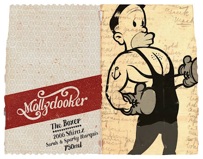
first of all, i love their logo. the two-line version is a knockout, but it also translates well to a single-line logo (find the two different ones above). i really am attracted to their overall label design though; they have a sort of vintage feel with the torn edges, faded colors, and illustration styles. 

a unique thing about their packaging, too, is that they started the trend of adding little collectible peel-off tabs so that customers can find the same bottle again at the store. it also doubles as a reminder of what you drank when you cant really remember the next day... also a lot of their labels wrap around so that you are more likely to buy the wine because you have to pick up the bottle (proven research, folks). AND some of their labels fit together to make a complete image, and all of them are personal to the couple and their family.

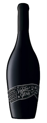
i think my favorite label is the Velvet Glove, which is a label actually made of velvet, with silver foil pressed into it. it even comes in a black velvet bag with satin rope ties on it. explains the $75 pricetag!

im not exactly sure who designs their labels; i couldnt really find an answer for that. but take a look around the website (which is also beautifully designed) and look at more of their labels.


i wish WALL-E was real.


for my birthday this year i received a copy of the disney/pixar movie WALL-E, which i saw in theaters while it was out. i have a mild obsession with robots, so i knew i would love the movie. AND I DID. 

first of all, wall-e's voice, the way he talks, the words he speaks, and his overall mannerisms are so hard to resist. seriously, try watching the movie with subtitles. add in the "saving the earth" theme and not to mention a robot love story. this is probably my favorite disney movie ever. 

now i just have a small 19-inch pink hello kitty tv that i got for my 16th birthday. therefore, HD did not exist then and im not upgrading any time soon. even though i watched it over 5 times during thanksgiving weekend, there were many details that i never even noticed. i didnt notice them until i was at my local meijer store, and while browsing the ipod accessories i heard that old familiar chirping of a  robot (my favorite is when wall-e hums the tune of his favorite song), so i immediately went to the giant wall of HD tv sets (various sizes). 

now i know i was standing pretty close to it, but let me just say that i am AMAZED by the level of rendering that is possible today. i know pixar is pretty much the best when it comes to 3D animation, but i didnt know it was like this. can we say ART FORM?? certain scenes in the movie (in fact pretty much all of it except for the people that live aboard the Axiom) look like they are live action scenes instead of 3D computer graphics. 

ive always wanted to be able to draw well; i dont think that is happening any time soon. and if i think that regular 2D drawing is difficult, i can only imagine the amount of work it takes to  produce an entire full-length film in 3D graphics.

either way, i recommend seeing wall-e. if you cant appreciate a rolling droid (who has a pet cockroach) courting a hovering bot, then at least you can appreciate the amazing, very convincing graphics. 

NOTE: the photos dont do the little guy justice. see the movie. on a larger screen, preferably in HD or on Blu-Ray.